
WEB DESIGN & DEVELOPMENT
Skilled in web development across fully-coded environments as well as the popular site builders like Wix, WordPress, Hostinger, Shopify, Square, and Squarespace. No matter the platform, the approach stays the same: build it clean, make it sing, and deliver exactly what the design calls for.
When a builder reaches its limits, custom CSS steps in to handle any layout or decorative element that needs a heavier hand.
Once a site is live, the work doesn't stop there. From on-page SEO and local search optimization to security hardening and ongoing maintenance, nearly every aspect of a site's long-term health is covered under one roof. No need to juggle multiple vendors or explain your vision to someone new.

Every visual element on a custom site is designed from scratch using professional UI software before a single line of code is written. Backgrounds, headers, footers, buttons, navigation, and animations are all built specifically for your brand and do not exist anywhere else on the internet. Nothing is pulled from a stock library or recycled from a template. What you get is a cohesive, fully original digital presence where every detail was made with your business in mind.


Most website builders hand you a library of pre-made buttons, hover effects, and interactive components shared by millions of other sites. When you choose a template, you're choosing from the same shelf everyone else is shopping from. The interactive elements on my custom-built sites are written from the ground up, coded by hand to behave, move, and feel exactly the way your brand demands. No shared libraries, no recycled interaction patterns, no "close enough." Every button, animation, transition, and hover state is an original piece of functional design built specifically for one client.


VS


FEATURED PROJECTS
Each website below represents a unique challenge, from B2B service platforms to brand-forwarding marketing sites for Tampa Bay's top real estate dynasty.
Scroll through to see the full case study.


Industry: Business Brokerage & M&A Advisory
Services: Web Design, Content Strategy, SEO, Maintenance & Security
Timline: 4 Week Build
Platform: Wix Studio
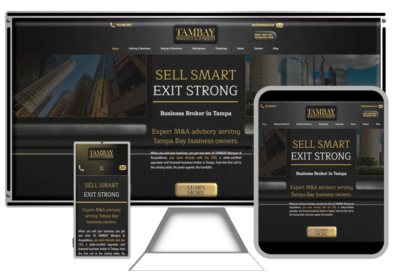
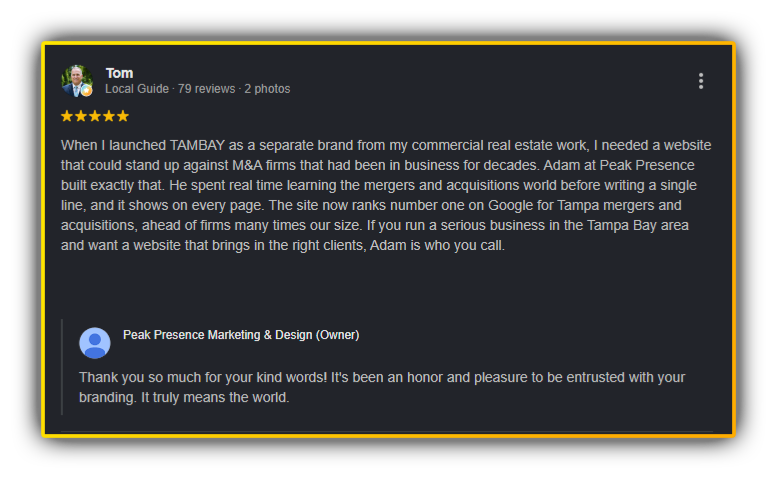
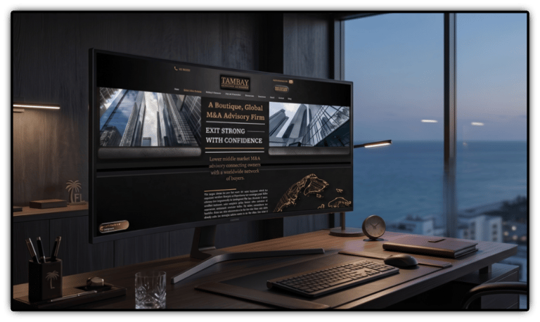
TAMBAY Mergers & Acquisitions entered the market as a new player in a field dominated by firms with decades of history. The broker's move into M&A was a natural evolution, as much of his commercial real estate work already revolved around businesses tied to the properties he was selling. Cutting out the middleman made sense, and his deep background in valuation and commercial sales meant he hit the ground running. The challenge wasn't his credibility; it was his visibility. The goal was to build a website that announced his arrival with the same authority as firms that had been in the game for 30 years, and then get that site ranking on page one of Google against those same established competitors.

The TAMBAY brand identity was built on a deliberate color theory decision rooted in market research. When studying the M&A industry, a clear pattern emerged: the largest, most established firms in the space had remarkably plain visual identities. Simple serif fonts, two or three muted primaries, nothing bold or expressive. That restraint works for a firm with 40 years of closed deals behind its name. Reputation carries the weight that design doesn't have to. TAMBAY didn't have that runway yet, so the visual identity had to do more work.
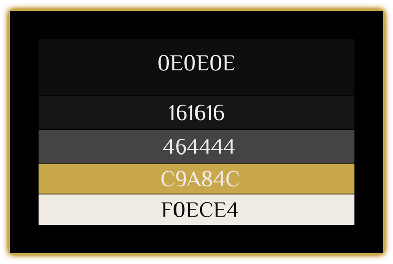


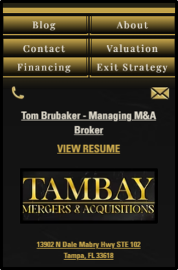
Every element outside the navigation was built from scratch in Affinity Designer. The beveled gold logo treatment, the custom contact icons, and the dimensional "Book Your Free Valuation" button were all original assets designed to carry the black and gold identity from the first pixel. No stock elements, no Wix defaults. A visitor lands on this page and immediately has two ways to reach Tom before they read a single word of copy.
The mobile header strips things down without losing the brand. The logo, a tappable phone icon, and a tappable email icon stay front and center for immediate contact. The hamburger menu opens into a full immersive experience rather than a basic dropdown, keeping the gold and black identity intact at every screen size.


The Header
The Footer
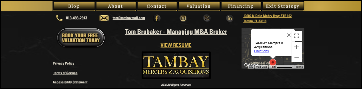
The footer mirrors the header's intent: every way to reach the team is visible before the visitor leaves the page. Custom navigation bar, contact icons, social links, CTA button, and an embedded map all built from scratch to close the experience the same way it opened.
The mobile footer keeps every critical touchpoint accessible on the smallest screen. Navigation, contact icons, logo, broker credentials, and a tappable address are all stacked cleanly without losing the gold and black identity that carries through the entire experience.
He also wanted the site built on Wix so he could manage and navigate it himself without relying on a developer for every small update. That was a reasonable ask, but it added a layer to the challenge. Wix is a capable platform, but it doesn't offer the creative freedom of a custom coded build or even WordPress with Elementor. Working within those constraints while still delivering something that looked nothing like a standard Wix site required pushing the platform further than it was designed to go, compensating with fully custom assets wherever the builder fell short.


Before a single wireframe or color choice, I spent a full day on-site with The Broker. The goal was to understand his business inside and out, and to learn the industry he operates in. A website built without that foundation is just a brochure with nice fonts.


What came out of that conversation reframed the entire project. By the time The Broker was ready to spin off a dedicated site from his commercial brand, he had already moved past main street brokerage and into lower-to-middle market mergers and acquisitions.
That distinction matters. A main street business broker sells restaurants, mom-and-pop retail shops, and other brick-and-mortar establishments. An M&A specialist advises and represents business sales running into the millions and tens of millions in revenue. The audiences are different. The decision-making is different. The copy, the design language, and the trust signals all have to reflect that reality.


In a technical industry like M&A, copy carries more weight than design. A potential seller looking to exit a multi-million dollar business reads every word for signals. Does this person actually understand the process? Has he done a deal like mine before? Is he the real thing?
That's where my UX and SEO experience converge. The copy on this site had to read like a practitioner wrote it. Every section was written to answer the specific questions a business owner asks during a sale, in the order they ask them, using the language they already use.
It also had to perform in search. I optimized the copy for traditional Google rankings and for visibility inside large language models like ChatGPT, Claude, and Gemini, which decision-makers increasingly use to vet professionals before they ever click a link.


This is where Google's E-E-A-T framework comes into play (Experience, Expertise, Authoritativeness, Trustworthiness). It's the lens Google uses to decide which sources to trust, and the same principles now influence how LLMs surface authoritative content. Writing copy that satisfies E-E-A-T is part of the job in any high-stakes industry.


A site like this lives or dies on copy, but copy density is its own design problem. Three thousand words of solid paragraphs sends a visitor straight to the back button, no matter how good the writing is. The challenge was packing the page with the depth M&A clients expect while keeping it visually approachable.
This is where decorative elements, coded animations, graphics, and photography earn their place. Each one breaks up the rhythm of the page and gives the eye somewhere to rest between blocks of text. The visitor moves through the page as if it were a story, picking up information as they go.
That pacing changes behavior. People stay on the page longer, scroll further, and absorb more of what's there. By the time they reach the contact form, they understand the process well enough to start a conversation with confidence. More time on the page leads to more phone calls. That was the whole point.


The Three-Level Site Architecture
The "30" refers to the target of 25 to 30 service-specific pages nested under a strict three-tier hierarchy:
Level 1 is the homepage, which operates as the Google Business Profile landing page. It is anchored to a real Tampa address, embedded map, visible license numbers (Florida appraiser #RD2130, real estate instructor #ZH1003617), and full LocalBusiness schema.
Level 2 is a layer of category pages covering the core services: selling a business, buying a business, financing, and industry niches.
Level 3 is the individual service pages targeting specific keyword and location combinations, including Business Valuation Tampa, Sell Your HVAC Business Florida, and Sell Your Medical Practice Florida.


The Core 30 is built around a single principle: dominate a local market by combining a tightly structured website with deep Google Business Profile integration, then sustain that dominance with disciplined editorial linking and a fixed maintenance cadence.


Each URL is engineered to capture a specific high-intent search. A buyer searching "sell my plumbing business in Florida" lands directly on a page built for that exact phrase rather than a generic services page. That precision is the difference between ranking on page one and being invisible.


The internal link structure follows the editorial linking principle. Rather than relying on nav menus and footers to do the connective work, the homepage and category pages carry body-copy paragraphs that flow into deeper pages with contextual anchor text. This signals topical authority to Google in a way that template navigation cannot.
Trust signals are reinforced everywhere on the site. Active memberships with the International Business Brokers Association, Business Brokers of Florida, and the Florida Gulf Coast Commercial Association of Realtors link out as external authority references. Real client testimonials, license numbers, and industry partnerships all live on the homepage, exactly where Google's E-E-A-T evaluation looks first.


The result is a site that consistently outperforms larger competitors in local search, drives qualified inbound calls without ad spend, and now serves as the foundation for The Broker's expansion into international markets.


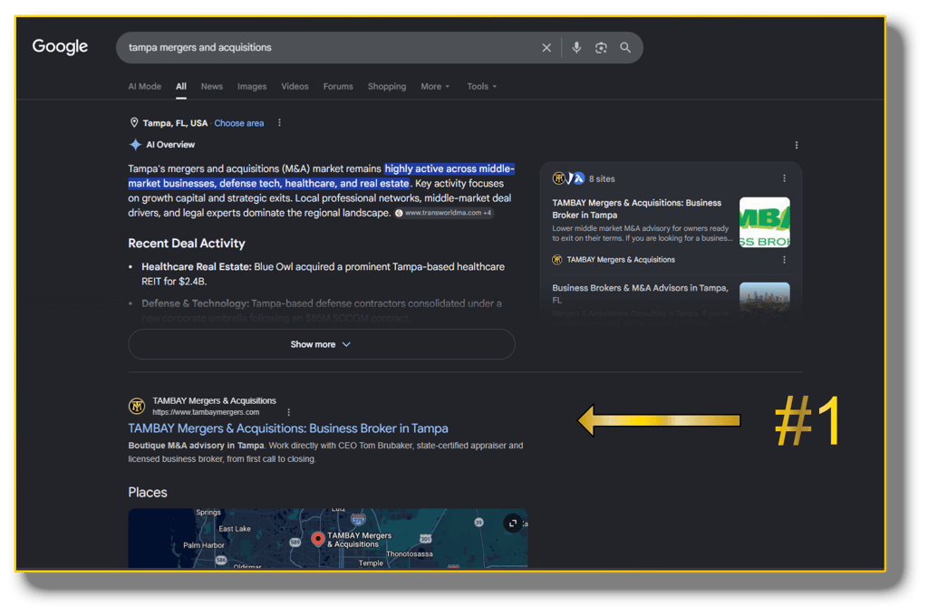
TAMBAY ranks number one on the first page of Google for Tampa mergers and acquisitions, sitting above firms that have operated in the industry for decades and global players like Benchmark International. For a brand built from the ground up with no search history behind it, reaching the top position against competitors of that size reflects how carefully the site was structured and written from the start. That ranking continues to anchor the brand's growth.


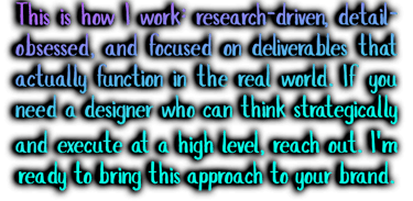
Every piece of the TAMBAY site was built from scratch, from the custom graphics to the layout to the copy on the page. The result is a website that looks the part and earns trust the second someone lands on it. If you want that same level of craft behind your own brand, let's build it.