Peak Presence Reborn, Unveiling an Exquisite Brand Identity
Explore my personal rebrand, a refined example of the bespoke identity I can craft for your business
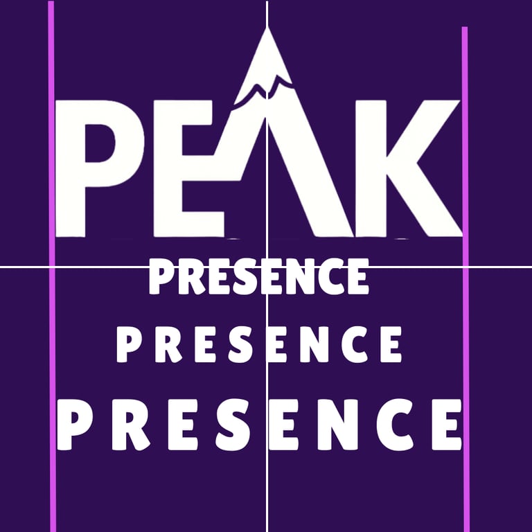
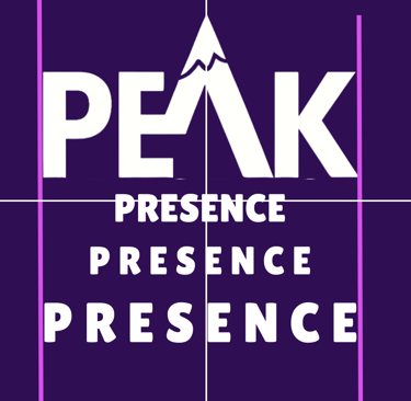
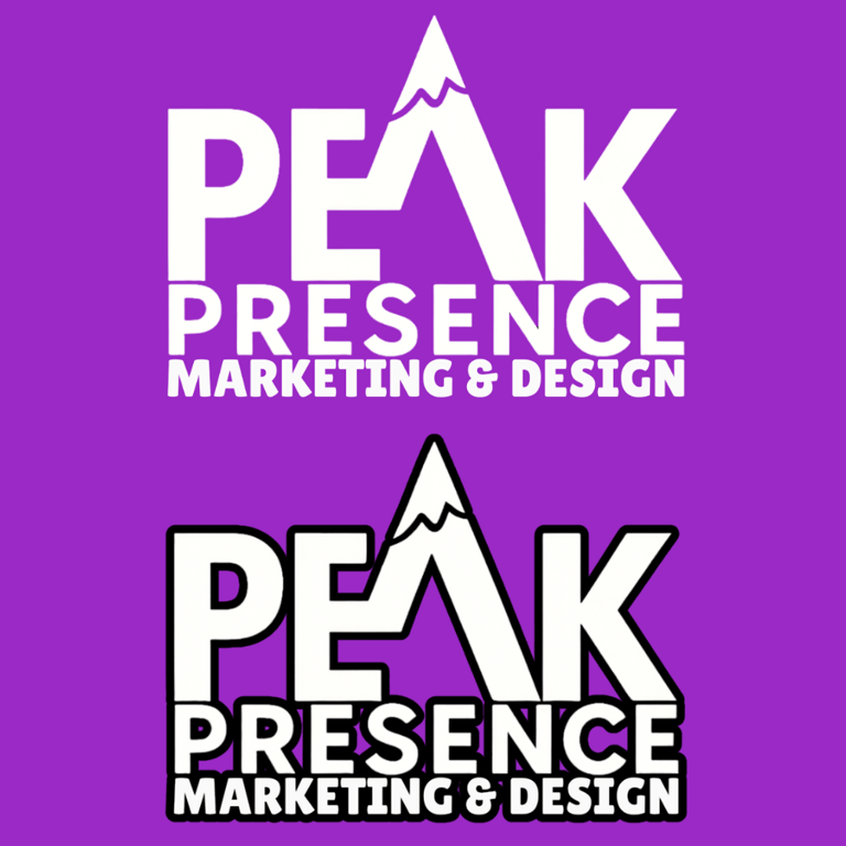
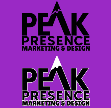
Brand Evolution
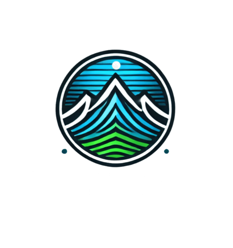
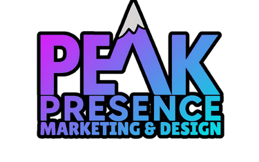
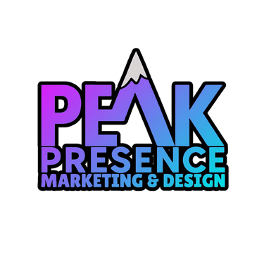
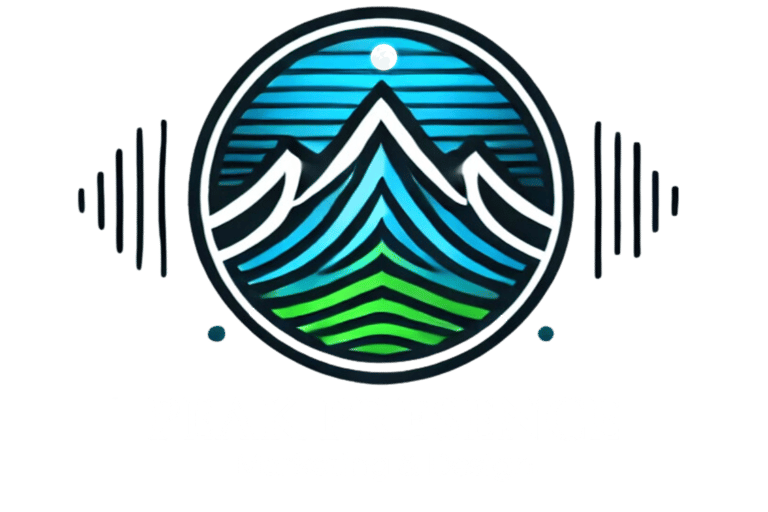
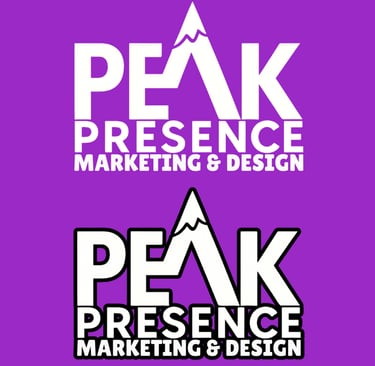
BEFORE
AFTER
The Story Behind the Peak Presence Brand
Why I Broke Out
For years, I used my talents under other people, bringing their ideas to life. I contributed heavily to large companies that still treated me like a replaceable number, even while I handled their marketing.
The Grind Before Peak Presence
Tired of the lack of respect and recognition, I took a risk and started my own business to build from my own heart and mind. It was the dream I carried for years. I knew I’d get to the top of my game and look back at the ones who doubted me.
What I Bring to Clients
I knew my skills could lift other businesses to the top of their industry and onto the front page of Google with branding and marketing done right. My wife and I are outdoors people, always hiking new mountains and finding the nerve to hit each peak. That mindset shows up in my work.
Naming the brand
After days of brainstorming, I landed on Peak Presence. I checked every platform. A few had the name, none were doing anything with it. I secured it, copyrighted it, and registered an S Corp in Florida.
Where I Am Now
Today, Peak Presence Marketing and Design is the backbone of my life. I have many passions, music and writing included, but graphic design funds the life I provide for my growing family. This brand had to count, and Peak Presence stuck.
How I Build Your Brand
When a new client comes in, I dive into their story and scratch the surface of their soul. We explore variations and concepts that hit the way Peak Presence hit me. I create the brand or logo, but the design, the colors, the meaning, and the passion come straight from your heart.
WHY THE REBRAND?
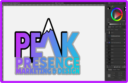
When I first launched Peak Presence, my logo was a simple reflection of what I knew: a few basic shapes, a touch of color, and a lot of passion. As I took on more challenging briefs and pushed my own design limits, I realized my personal brand mark wasn’t keeping pace with my growing skills.
Every new client project became a mini-lab: I would experiment with hue, value, and contrast late into the night. Sometimes, sketching in pen, sometimes manipulating pixels. I felt a spark each time I unlocked a color combo that just “felt right.”
I still remember the thrill of finishing that mark and sharing it with my network. At the time, it felt like the perfect distillation of everything I’d learned about form, balance, and color. It held up flawlessly on my website, business cards, and social media posts alike. In that moment, I was genuinely proud of what I’d achieved, and it was a true reflection of my skills and the creative place I’d reached.
Why The Badge Had To Evolve
When I launched Peak Presence, my color choices came from instinct, not formal theory. Blues and greens felt safe, gradients pleased the eye, and that was enough for a while. Then I dove into color psychology, harmony rules, and accessibility contrast ratios. I studied Josef Albers, built custom palettes in Affinity Designer, and stress-tested every hue on real-world mockups.
The deeper I went, the more I saw the gap between what I could create and the circular badge that sat on my site. It was clean, but it no longer showed the range of my skills. Because the badge was mine, it spoke for every project that followed. If it looked dated, clients would assume my work was dated too. A full redesign was the only move. I wanted a logo that proved my understanding of contrast, palette balance, and modern brand storytelling from the very first glance.
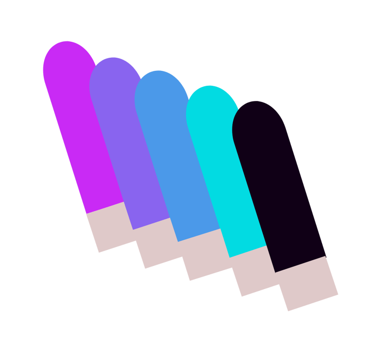
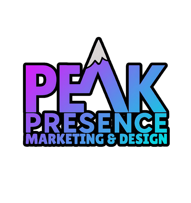
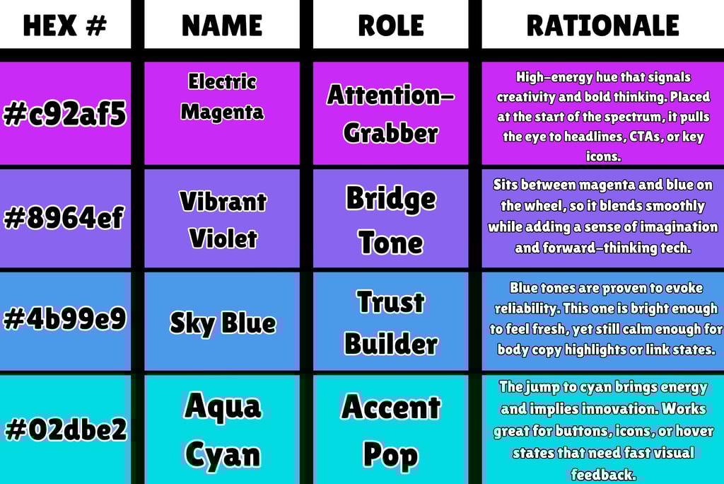
Quick overview: The palette moves smoothly around one side of the color wheel, shifting from hot magenta to cool cyan, then anchors the set with solid black. That progression creates built-in harmony and lets you build dynamic gradients without the hues fighting each other.

Letterform Sketch Session:
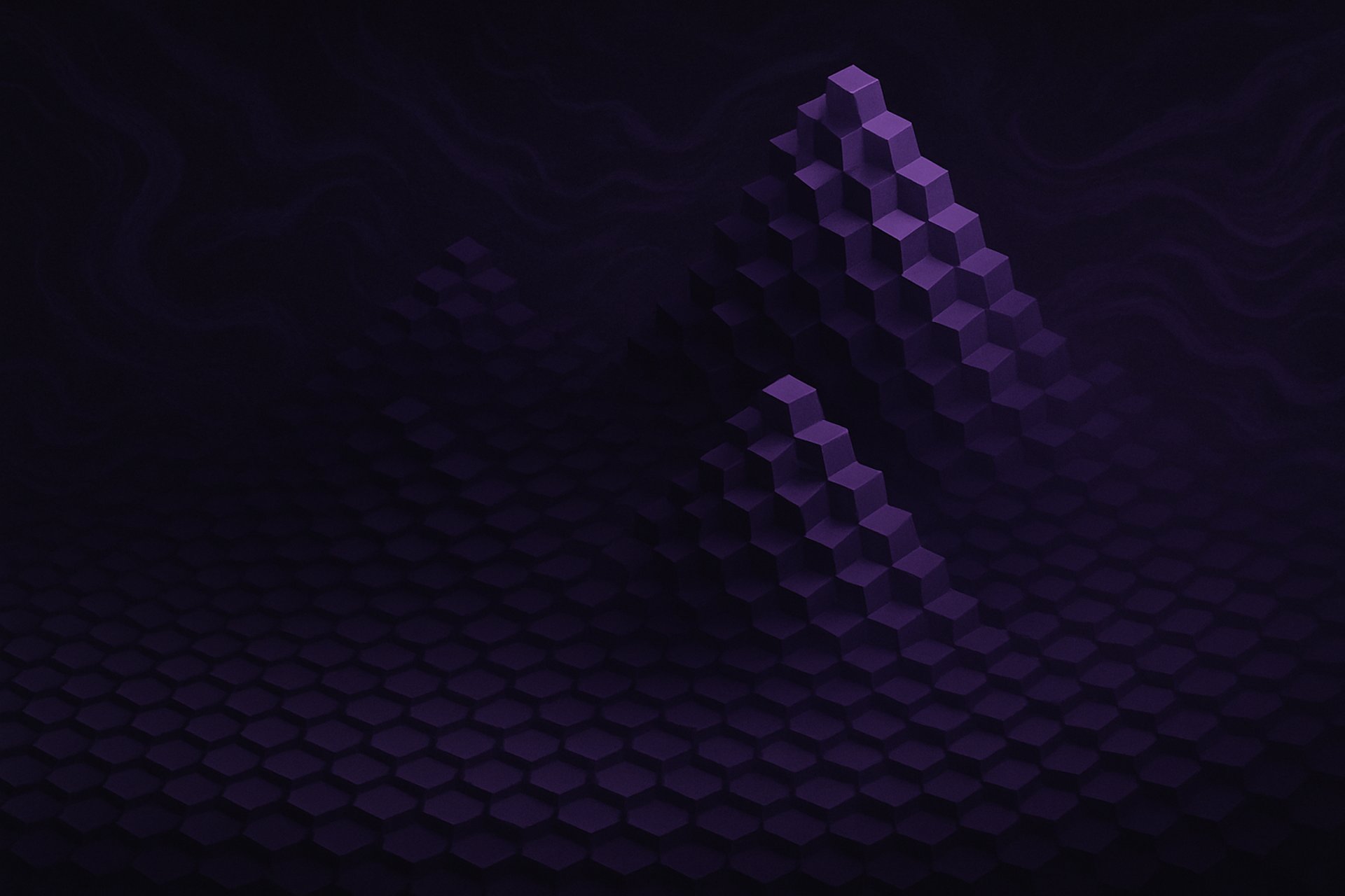
I built the base concept around the letters P E A K and carved the A into a sharp summit so the mountain lives inside the word, not as an extra icon. I am not a natural illustrator and I do not pretend to be, but quick pencil sketches still matter. A rough sketch gives me symmetry targets and spacing cues. I move fast on paper, then get meticulous with the mouse in Affinity Designer. From dozens of thumbnails I selected three legible directions, scanned them, and rebuilt the forms as clean vectors. The A apex was tuned by eye for a crisp silhouette at small sizes. Everything was proven in one color first, then tested at favicon scale before any styling.
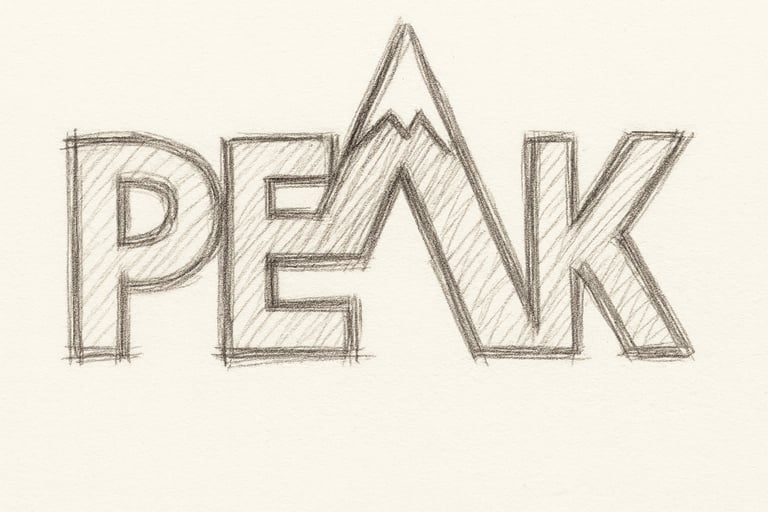
-Word study: lock the idea to P E A K. The A carries the summit story.
-Fast pencil passes: 20 to 30 thumbnails. One idea per box. No shading.
-Shortlist three: pick for legibility, silhouette, and clear peak read.
-Scan and straighten: prep sketches as tracing guides.
-Vector build in Affinity Designer: pen tool, closed shapes, clean nodes.
-Optical tuning: adjust counters, spacing, and the A apex by eye.
-Monochrome proof: black first, then invert to white on black.
-Micro-tests: shrink to favicon size and run a light blur test.
-Variants: primary wordmark, peak-A icon, stacked lockup. Export SVG and PNG.
Method block
Font Selection and Typography
I am a font and calligraphy nerd. I study calligraphy to understand stroke contrast, rhythm, and how letters breathe, then I test typefaces to see which ones carry that feel in a clean, repeatable way. For this mark I needed creative energy with professional control, so I chose Lilita One, a bold sans serif display face with enough personality to stand out without turning goofy. After setting the type, I tuned spacing by eye, adjusted kerning pairs, and tested caps vs small caps. Where it served the concept, I wove letters together, as in the PEAK icon. I save heavy fusion tricks for artists and bands, but for the core brand I kept the structure clean so it scales from favicon to signage.
WHY A SANS SERIF?
Sans serif gives a modern, direct read at small sizes and on screens. The forms stay open, strokes are even, and counters do not clog. For a brand called PEAK that leans toward clarity and momentum, a sans serif supports the story. Lilita One sits in the display category, so it carries character in headlines and logos while still holding up when reduced.

The Importance of Contrasting Black and White Versions of the Logo
After the base logo was finalized and the icon and type were aligned, I built a full color set plus strict black and white versions. A simple inversion handles the basics, but the goal is reliability. Clients use logos on everything from dark websites to light print, so providing both positive and reversed marks prevents last-minute hacks that hurt legibility. I also include edge-case variants with a thin contrasting stroke or a subtle shadow for complex photos, but those are controlled and only used when a flat mark cannot hold contrast.

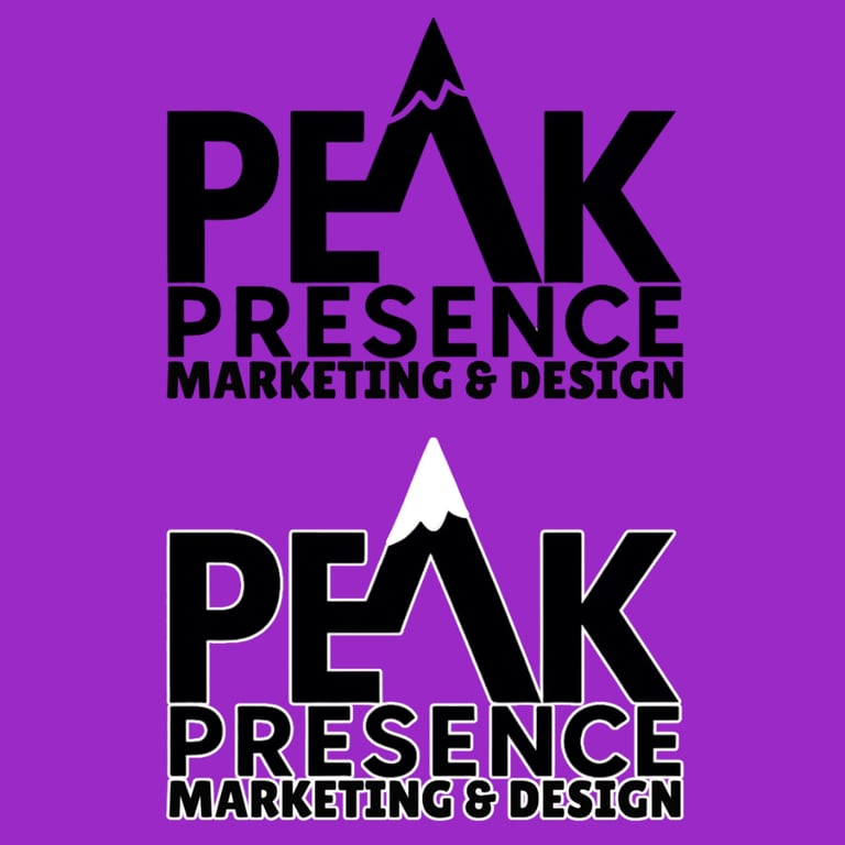
I proof each version at tiny sizes and on real backgrounds. Black and white marks are the stress test. If the silhouette reads in one color at favicon scale, the concept is sound. Color then becomes enhancement, not a crutch. I deliver RGB hex for screens, CMYK builds for print, and a Pantone spot when a single ink is required. This keeps brand color consistent across monitors, printers, vinyl, and embroidery. The result is a set that covers light, dark, and busy placements without redrawing the logo every time.
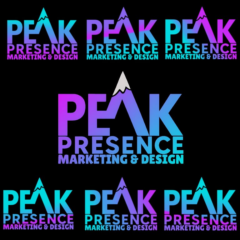
Elevating the Design with Custom Gradients
Gradients are where color truly comes alive. Sure, I could have applied basic solid colors to the logo, but what fun is that? Long before I became a graphic designer, I was fascinated by how artists like Jules Olitski, Wang Guangle, and Ann Janssens built depth and emotion with layered hues. For this logo, I dove into Photopea, testing dozens of gradient blends until I found the perfect balance of vivid violet, sky blue, and aqua. It does add time to vectorization, but I treat every project like it’s my own. My ADHD may have me chasing variations for hours, yet the final result always makes it worth the effort.

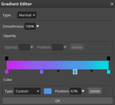
When I set up a multi-stop gradient I start with a simple mathematical strategy, dividing the spectrum into equal segments and placing each hue at 0 percent, 25 percent, 50 percent, 75 percent and 100 percent. That creates a perfectly even progression from magenta through violet and blue to cyan. From there I nudge individual stops by a few points, for example shifting the mid-blue position from 50 percent to 47 percent, to pull focus or deepen a particular tone. Photopea and Photoshop let me adjust smoothness, switch blending types and even add extra opacity or noise stops. Those tools transform a basic gradient into a playground for unexpected texture and fascinating color interplay.

THe final and most important element: vectorization
Logos must scale from favicon to billboard without falling apart. That is only possible with vectors. A vector is built from mathematically defined paths and nodes, which means infinite scale, razor-clean edges, and precise control over curves and corners. A raster (PNG/JPEG) is a grid of pixels. Scale it up and you get blur, stair-steps, and compression artifacts. Hand a raster logo to a sign shop or screen printer and they will have to rebuild it for you. That adds cost, delays, and uncertainty. If your brand matters, pay for proper vectorization.
Why I don’t trust AI for this step (yet)
Auto-trace and AI tools are fast, but they round corners, miss tiny counters, and smooth out intentional angles. That ruins letter rhythm and creates micro-wobbles you only notice when the mark is big on a van, banner, or storefront. This logo was traced manually, node by node, so curves are true, apex points are crisp, and every junction aligns on a clean grid. AI can help explore styles. It cannot replace precision vector building for a master logo file.

Raster vs Vector: quick reference


-Raster (PNG/JPG): fixed pixel grid, softens when enlarged, best for photos, social posts, and textures.
-Vector (SVG/PDF/AI): resolution-independent paths, stays sharp at any size, required for logos, signage, vinyl, embroidery, and any single-ink process.
Placement: vectors drop cleanly into print layouts, laser cutters, CNC, plotters, embroidery, and web. Rasters do not survive scale or production tweaks.
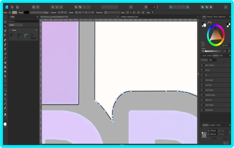

My manual vector method (Affinity Designer)
1) Place the sketch or previous PNG on a locked reference layer at 30–40% opacity.
2) Pen Tool only. Draw closed shapes for each letter and interior counter. No auto-trace.
3) Keep Bézier handles short and aligned. One curve per contour segment. Fewer nodes, smoother curves.
4) Align critical geometry to a grid. Snap apex points and verticals.
5) Build overlaps intentionally. Then merge, subtract, or divide with Boolean ops to get single, watertight shapes.
6) Optical tune: nudge node positions so corners look balanced at small sizes.
7) Stress test: scale down to 16 px and 24 px, run a 4–6 px blur, then check the silhouette on black and white. If anything muddies, simplify the path.
8) Finalize variants: flat black, flat white, and full color. Add a thin keyline version for photo backgrounds.
9) Export masters: SVG (flat fills), PDF/X-1a for print, EPS for legacy shops, and transparent PNGs at 1x/2x/4x.
What clients actually receive
Master vectors: SVG, PDF/X-1a, EPS.
Web assets: PNG on transparent, in brand color, black, and white.
Usage notes: when to use color vs black/white, when the keyline is allowed, and which file types to send to sign and merch vendors.
Cost of skipping vectors
If you only have a PNG, vendors will either reject the file or charge to recreate it. You lose control over curves, spacing, and color matching. You also end up paying twice. Proper vectorization is cheaper than retrofitting later.
Ready to clean up your logo and lock your brand in?
Book a free 15-minute consult or send me your files for a quick vector check. I will tell you exactly what stays, what goes, and what it takes to make your mark scale from favicon to billboard.