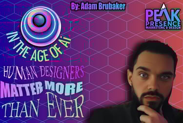
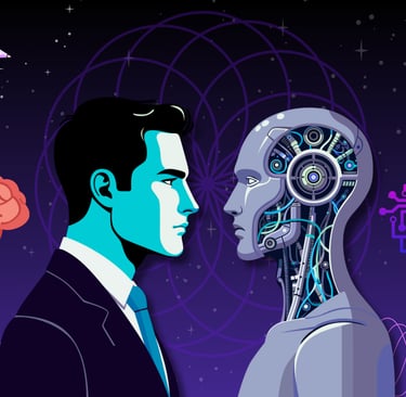
In the Age of AI, Human Designers Matter More Than Ever
In the Age of AI, Human Designers Matter More Than Ever: strategy, color and shape psychology, and vector craft turn fast AI ideas into brands that scale well.
Adam Brubaer
9/25/20258 min read

In the Age of AI, Human Designers Matter More Than Ever
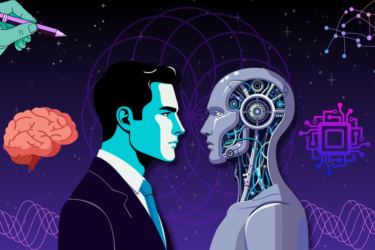
I was an early adopter of AI, and I am actively following its evolution. Because of that, I know better than most that, as much as I admire the tech and have high hopes for where it can go, it still has a long way to go before it replaces professional human graphic designers.
AI is everywhere in design. I use it. I like it. I also know where it breaks. Tools like Midjourney and Nano Banana are fast at making images, not at building brands. They do not thoroughly interview you and your team, define your audience, or plan for how a mark behaves on a hat, a truck, a favicon, and a billboard. If you want a logo that looks sharp, scales cleanly, and supports business goals, you still need a human who understands systems, production, and taste.
People often Google phrases like “logo design,” “logo cleanup,” “brand identity designer,” “vectorize logo,” and “convert logo to SVG.” Those searches are fine, but the result you want is not a pretty picture. You want a reliable process that ends with files you can deploy everywhere without headaches.
What AI does well
AI is great for ideation and inspiration. I use it to explore mood, composition, and lighting. It helps me test several directions fast. It can also help non-designers get a rough idea on-screen, so we can discuss it. That is useful. It saves time. It allows me the ability to draft up concepts without having to draw everything. Before AI, half the workflow would be drawing up concepts, and while I still hand-draw for initial ideas, AI renders can open the door for endless possibilities.
AI is great for many different purposes and use cases outside of the art and design space.
AI is strong at practical work that speeds up projects:
Reading PDFs and docs, pulling out requirements, dates, and constraints
Summarizing and interpreting long reports, emails, and message threads
Solving advanced math and data problems, and generating spreadsheet formulas
Translating between languages and cleaning grammar and tone
Drafting first pass copy and rewriting to match a voice
Classifying and tagging large sets of files or images
Generating code snippets and test cases, and suggesting debugging steps
Turning meeting transcripts into action lists and timelines
Automating repetitive tasks with templates and batch exports
Where AI Misses (Currently)
I mentioned "Currently" because AI is evolving at a significant rate, and I can only assume this is the worst the technology will ever be, but currently, AI design work still has a long way to go before it can efficiently mimic the skill set of a professional graphic designer.
The last mile is where the work gets real. That is where AI falls down, and a designer earns the fee.
Vector integrity. AI outputs are not built for fabrication. Paths are messy, overlaps are wrong, anchors are noisy, and strokes do not expand cleanly. A logo must be rebuilt by hand to hold up in embroidery, screen print, laser, and tiny digital sizes.
Typographic control. Kerning, optical alignment, and rhythm do not come from prompts. They come from judgment. Your word mark needs spacing that reads as intentional at 16 px and 16 feet.
Color management. AI gives you shiny gradients that buzz on screens and die in CMYK. A real brand needs a palette that stays consistent in RGB, HEX, CMYK, and spot.
Uniqueness and risk. AI leans on training data. That can pull your mark toward something close to a competitor. A designer pushes shape language toward distinct and defensible.
The nuances of the psychology of shapes and colors
This is where cutting corners backfires. A business owner asks a marketing manager to “make a logo with AI,” and it looks fine at a glance, but the fundamentals are missing. Circles read as friendly and inclusive. Triangles suggest movement and direction. Square forms imply stability and trust. Color hits even harder. Blues calm and reassure. Reds grab attention and can signal urgency. Greens suggest growth and health. These are not rules to memorize once. They are tools to select with context, contrast ratios, industry norms, and audience expectations.
AI does not weigh these trade‑offs for your goals. Non‑designers often do not see the pattern language at play, so choices feel arbitrary. The result can be on‑trend and still wrong for the job. A human designer ties shape and color to positioning, market, and medium so the brand speaks on purpose.
“We tried AI and it looked fine on Instagram”
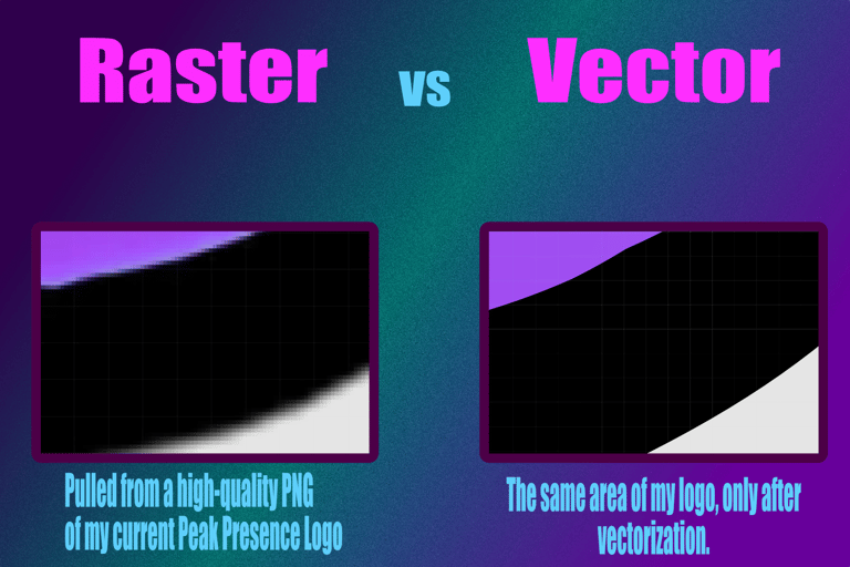
This is common and understandable, especially for a non-designer trying to save a buck in a rough economy. It does not show up until you try to put the logo anywhere other than a social cover photo. The avatar turns to mush. The one-color version collapses on a stamp. The SVG has a giant view box, odd transforms, and hidden rasters. Then the print shop calls and tells you the art is not clean and needs a full retrace and vectorization.
Here is what clean production looks like when I deliver.
Vectorize logo done right: Bézier paths with minimal points, proper joins, and true symmetry where it counts. No stray anchors. No doubled shapes.
Logo cleanup done right: remove artifacts, fix overlaps, unify stroke logic, normalize corner radii, and align to a grid so the logo snaps at common sizes.
Convert logo to SVG done right: organized groups, consistent view box, reusable symbols, and no embedded rasters. Files are lightweight and render fast on the web.
A logo design from Peak Presence is built to go anywhere. Embroidered bathrobes, baseball caps, coffee mugs, jock straps, and even a giant billboard in the middle of Times Square. It all holds up. Proper vectorization creates a truly lossless design, so the quality stays sharp no matter the size or placement.
Yes, there are AI tools that claim to vectorize. The quality is not there. I have tried to cut corners with AI vectorization, and I was disappointed. These tools can nail a few elements, but the final pass still needs a professional designer. If you want clean paths, correct joins, and files you can actually print, hand it to someone who does this for real.

Prompts will only get you so far
A brand is not a single image. It is a system that handles real constraints. Accessibility, contrast, motion, dark mode, signage distances, and small‑size legibility are not handled by AI. That is brand architecture. That is my job. The process is simple and direct.
Discovery. Business goals, audience, use cases, and competitors. Clear constraints.
Concept. Sketch, AI exploration if helpful, then lock a direction that fits the brief.
Build. Rebuild in vector from scratch. Test at micro and macro sizes. One‑color proof.
Refine. Optical balance. Kerning by eye. Grid and spacing rules.
Deliver. SVG, PDF, EPS, and PNGs in a tidy library with usage notes.
“Can AI get there?”
Probably, but that is not today. Even when it does, most people will not learn the production layer that makes or breaks outcomes. You can tell when a company cheaped out and shipped an AI image as a logo. Trendy, generic, and fragile. It reads as low effort. It signals the wrong things to buyers and partners.
Let’s call it what it is. AI slop. Slop is work that leans on a generator with little craft, no system, and zero proofing. It looks fine in a scroll, then breaks the moment it leaves the mockup. Designers see it. Printers see it. Developers see it. Clients notice it when their avatar turns to fuzz and their banner looks off. Most industries now frown on slop because it wastes time, creates rework, and cheapens the brand.
You might think the average person cannot spot an AI logo or image. Many can, even if they cannot name the tell. There is a distinctive contrast profile in most AI renders. Edges feel too clean or strangely soft. Micro highlights and shadows fight each other. Color ramps buzz. Textures repeat. Faces and hands get uncanny. The longer you look, the more it unravels. This is still true after years of model updates.
I test new AI models and tools constantly. No matter which system you pick, getting an exact idea out of your head takes real time. You go back and forth with prompt tweaks and style weights. You chase a look, get close, then the next render swings wide again. It is frustrating. When you finally land on something usable, you hit the next wall. Vectorizing. Paths are noisy. Overlaps are wrong. Anchors explode. You fix one area, and another falls apart. The cycle repeats. That is why slop happens. The process stops at the image, and no one finishes the job.
How I combine AI with real craft
I treat AI as a sketch partner, not a finish line. I prototype a few directions with Midjourney, decide what deserves to live, then rebuild it clean. I test the mark at 16 px, at 32 px, and in one color. I set a type scale and color tokens so your site, socials, and print agree with each other. I deliver files that drop into Canva, Photopea, and your CMS without drama. Same approach for album art so it pops on platforms and prints clean on posters.
I have also been turned down and scorned for saying that AI helped spark an idea. Some people do not understand what AI is or how to use it responsibly. There are levels. On one end you have slop. On the other, you have a pro using AI to break a creative rut, pressure test directions, and move faster before doing the real craft. Those are not the same.
I care about the ethical questions. The environment matters. The health of the job market matters. At the same time, this technology is not going away. It is on us to keep learning so we are a step ahead of the tools. I heard a quote that stuck with me. "You will not lose your job to AI. You will lose your job to someone who uses AI". That is the path forward. Use it well, then finish the job like a professional.
What you get when you hire Peak Presence
A clear process and fast communication.
Professional branding you can carry for years.
A logo you can place on anything, from embroidery to billboards, without quality loss.
Files developers and printers appreciate, organized, and to spec.
Vector masters with clean paths, proper joins, and optimized SVGs.
A practical brand toolkit: color, type, spacing, and usage rules.
Real-world proofing at tiny and large sizes, in one color and full color.
An opportunity to bring your imagination to life and land the exact visual that represents what you’re truly passionate about.
If you want a brand that holds up
Feel free to use AI for ideas and bring in a human to finish the job. Book a consult with Peak Presence Marketing and Design. Bring your AI mockups, napkin sketches, or a tired mark that needs a rebuild. I will keep what works, fix what does not, and deliver a logo and identity you can trust.
Peak Presence serves Tampa Bay, St. Petersburg, Clearwater, Dunedin, Tarpon Springs, and Palm Harbor. I handle logo design, brand identity, vector cleanup, and clean exports you can actually use. Need to vectorize a logo or convert a logo to SVG for developers and printers. I do that. Full services include SEO, graphic design, web design, AI integration, and blog posting, so your identity, site, and content move in sync. When you are ready for work that scales from a favicon to a billboard, reach out.